Accessibility Checkup: Have You Addressed These 7 Quick Wins on Your Website?
Most website accessibility problems aren't the result of some sweeping architectural failure.
They come from everyday decisions that are easy to overlook: link labels, error messages, heading structure.
The good news? A bunch of them are easy to fix once you know what to look for.
Here are the seven best practices we’ve found easiest for a lean web team to resolve quickly:
1. Use Meaningful Alt Text for Images
Alt text is what screen reading tools say aloud when they encounter an image. It's also what shows up when your image fails to load.
When that happens, browsers show an icon in place of the image. Existing alt text will appear beside that icon, giving context even when the image is missing. But without alt text, users only see a broken icon with no explanation.
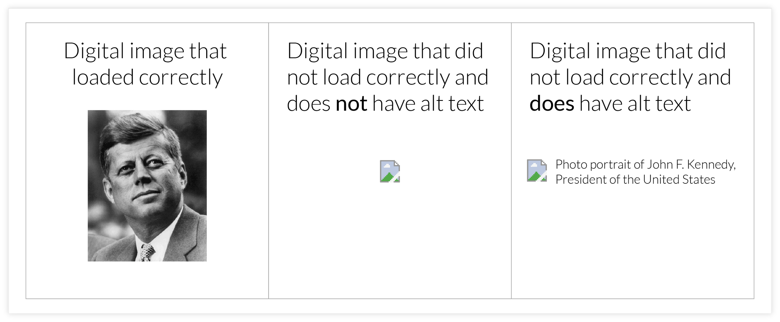
So what you should put in an image’s alt text field? A filename like "banner_FINAL_v3" doesn't communicate anything of value to the user. You should describe what the image actually shows.
But there's also a legitimate exception worth knowing: decorative images (dividers, background textures, or images already described in nearby text) can and should have their alt text left intentionally blank.
That tells screen readers to skip the image entirely, which is actually the right call when an image adds no new information.
For everything else, think about what the image is actually communicating. "Photo portrait of John F. Kennedy, President of the United States" gives a user something to work with.
Ask yourself: if this image disappeared, what would a visitor miss? If the answer is "nothing," blank alt text is fine. If there's something to miss, write that.
2. Try Navigating Your Site Without a Mouse
Open your site, set your mouse aside, and press the “Tab” key on your keyboard.
Can you reach all the navigation elements in menus?
Can you interact with links, buttons and forms throughout page content?
Does a visible highlight or outline follow you so you know where you are on the page?
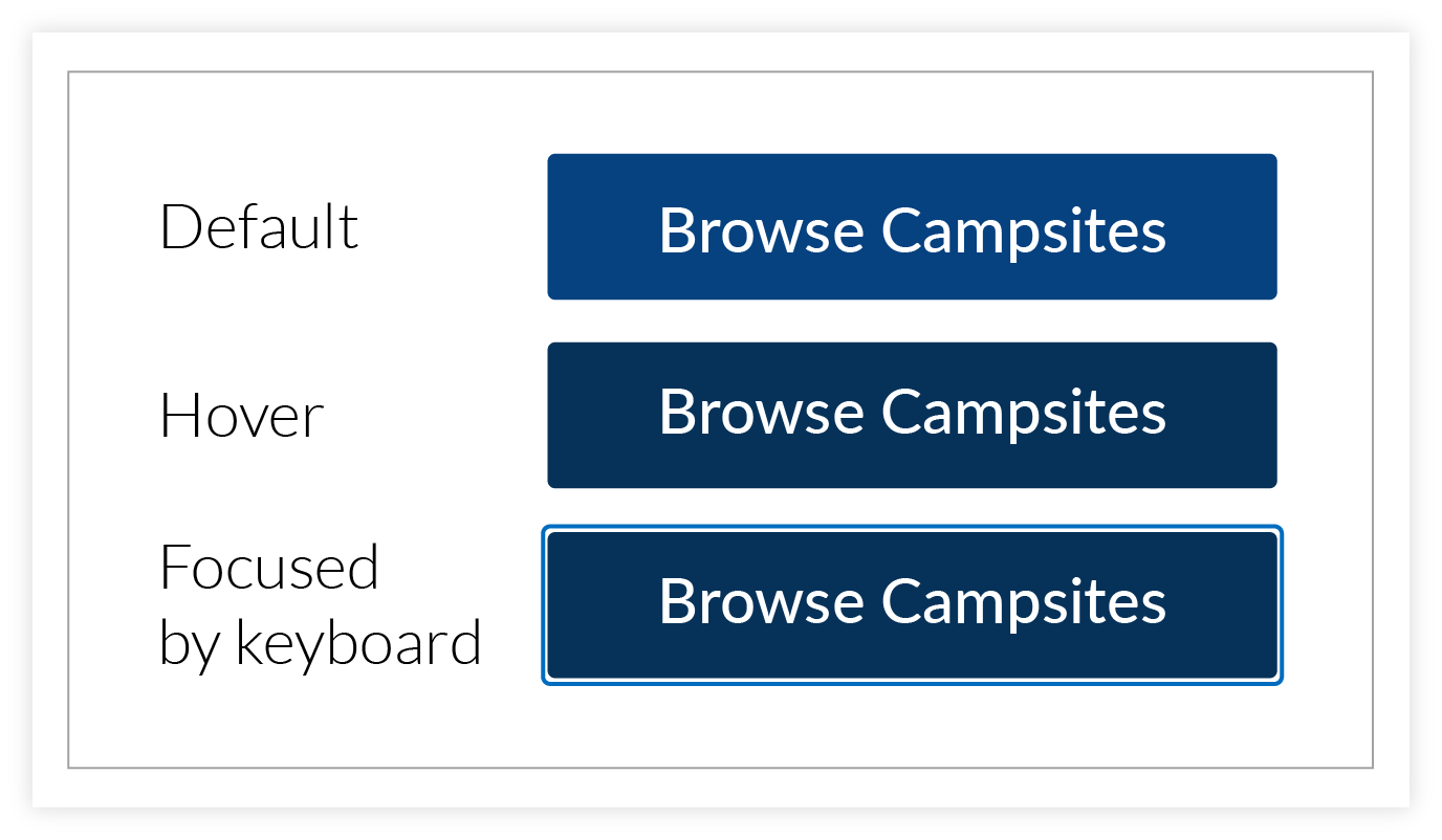
Keyboard navigation is essential for people with motor disabilities and anyone using assistive technology. If tabbing through your site feels disorienting, here are a couple of things to check:
Make sure interactive elements have a visible focus style. If the highlight disappears when you tab to something, that element probably needs a CSS focus outline added or restored.
Check that nothing is skipped. If Tab jumps over a button or a menu, that element may be missing from the tab order entirely, which can be easily fixed by a developer.
A quick tab-through only takes a few minutes and can reveal issues that are often straightforward to resolve once they're spotted.
3. Use Headings Like a Map
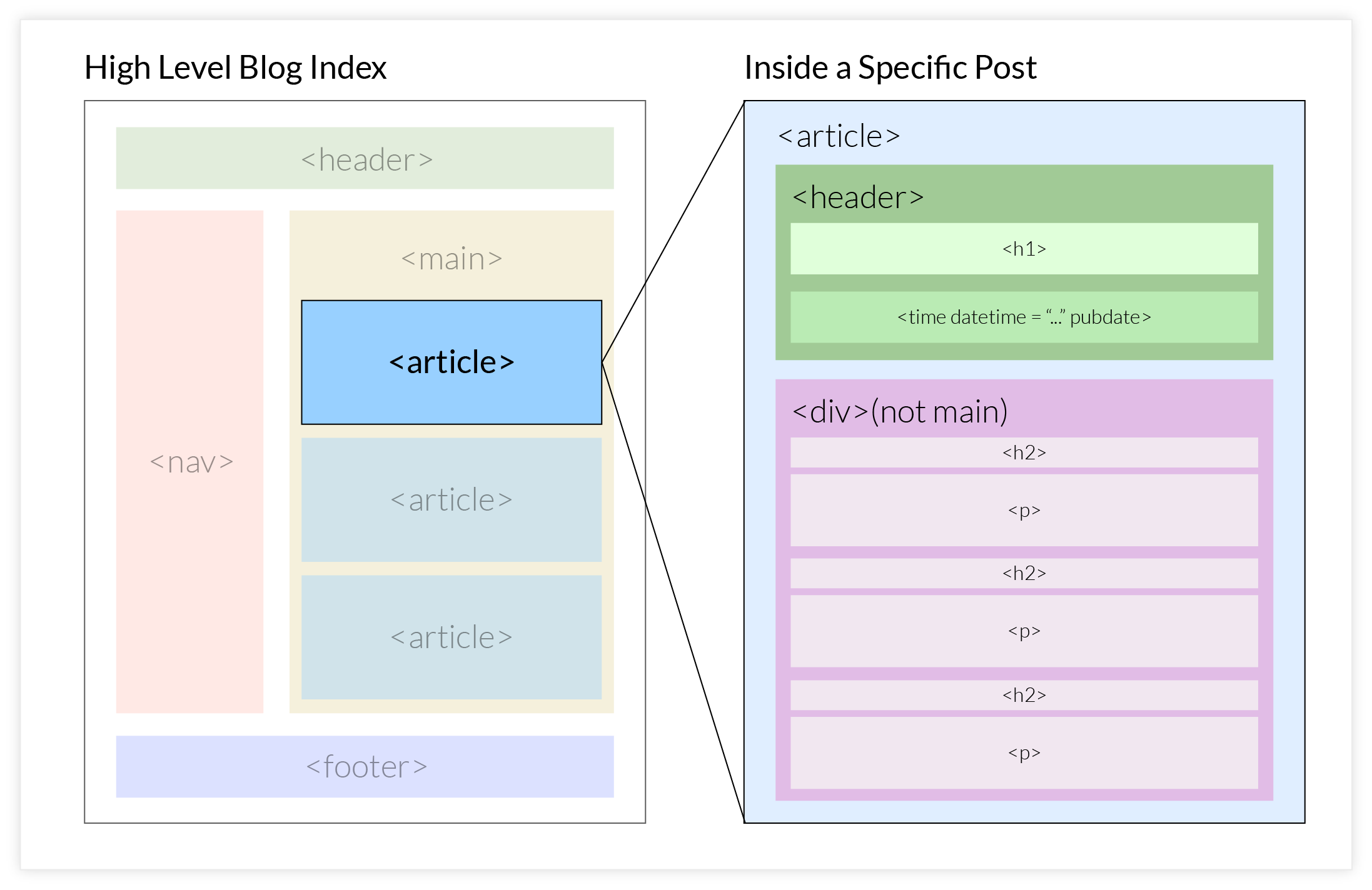
Your page headings are both a visual styling choice and an outline of your page’s content.
They’re an important way of communicating structure to anyone navigating with assistive technology.
Screen readers use headings to help users jump between sections, understand where they are, and get a sense of the page at a glance.
The basic hierarchy is straightforward:
H1 for the main page title (you should only have one of these per page).
H2 for major sections.
H3-H6 for anything nested within those (just don’t skip levels or nest these out of sequence).
(And if you need more than six heading levels, your content structure is probably too deep and should be simplified.)
A good gut check is to imagine reading only the headings on a page. Do they tell a coherent story? Can you tell what the page is about and how it's organized?
If your site uses a content management system like Drupal, heading levels are usually available in a dropdown in the text editor. It's worth taking a few minutes to get familiar with them if you haven't already. Building the habit of using heading levels thoughtfully and consistently will make a noticeable difference over time.
4. Add Captions (or Transcripts) to Videos
Video content is a great way to connect with your audience, especially in higher ed, with features like campus tours, admissions videos, recorded lectures, etc.
But without captions, a significant portion of visitors will struggle to engage with it or be entirely excluded.
That includes people who are deaf or hard of hearing, non-native English speakers, and plenty of people watching silently at their desk.

Captions give everyone a better experience: they make videos easier to follow, help viewers retain information, and let people watch without sound. Luckily captioning has gotten a lot more accessible as a process.
YouTube and Vimeo both generate automatic captions that you can edit and correct directly in the platform.
If you're embedding videos on your site, it's worth logging into whichever platform hosts them and reviewing what's already there — you may be closer than you think.
Even imperfect captions are better than none, and a transcript can often be repurposed as a blog post, a summary, or a resource for anyone who'd rather read than watch.
5. Write Descriptive Link Text
Generic link text like “Click here” or “Read more” may work visually, but it lacks the context necessary for those using assistive technology.
Many screen readers allow users to pull up a list of all links on a page, which we’ve seen people rely on heavily in live moderated testing scenarios.
But if multiple links in the list are labeled with the same phrase, the list becomes meaningless.
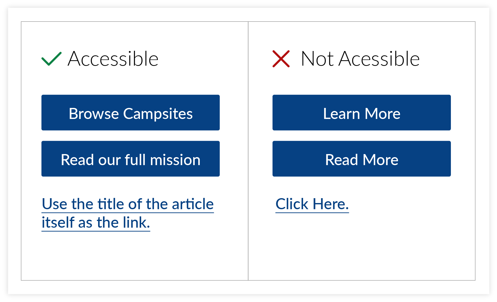
When naming any button or text hyperlink, describe where it goes or what it does, rather than relying on the surrounding verbiage to provide context.
View membership benefits.
Download the annual report.
Explore graduate programs.
These work on their own, even out of context.
A helpful editing habit: read your links in isolation and ask whether they make sense without the surrounding content. If a link just says here or this page, it's worth rewording.
This change adds clarity and a purpose-driven feel to your website’s user experience, both for screen reader users and for anyone else skimming the page—which let’s be real, is most people, most of the time.
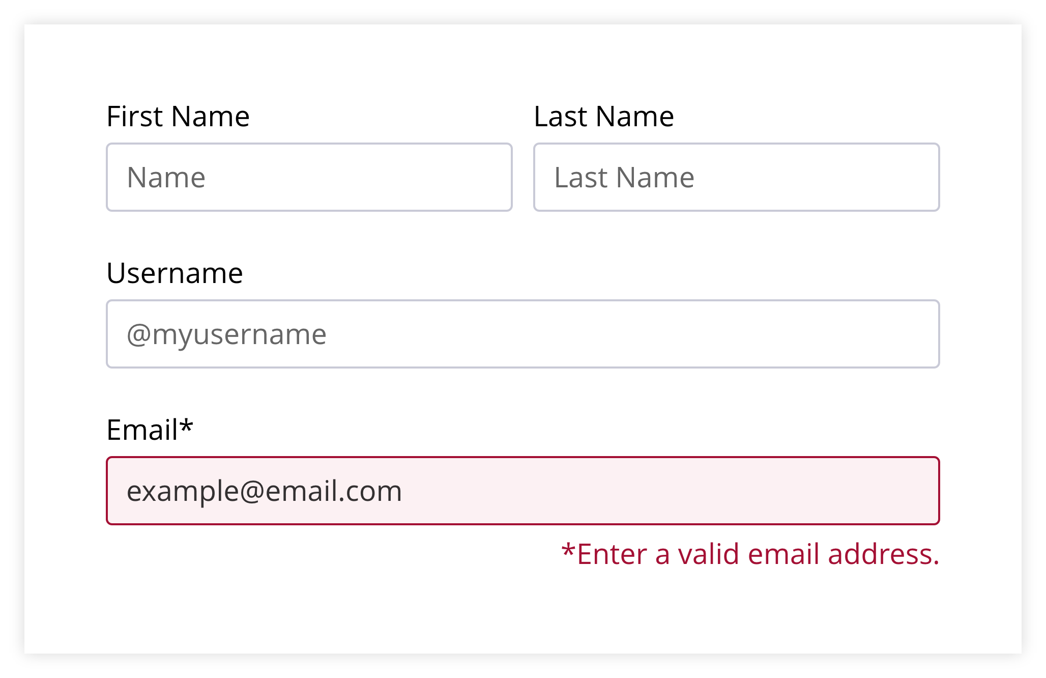
6. Provide Clear Form Instructions and Helpful Errors
Forms are one of the most common points of friction on websites.
Confusing instructions or vague error messages can lead to abandoned applications, incomplete registrations, or frustrated users.
Users should clearly understand:
What information is required vs. optional
What format is expected (dates, phone numbers, etc.)
How to fix errors if something goes wrong
For example, an error message like “Invalid input” doesn’t help anyone. Rather, a message like “Please enter your phone number in this format: (555) 555-5555” immediately tells the user what to do.
This is also a good example of where better design of the functionality itself could prevent the error altogether.
Using a field that automatically formats input allows the user to just type “5555555555” and not worry about the hyphens or parenthesis, because the field will add the punctuation on its own.
That’s probably a lot easier if someone’s entering the information with speech-to-text, too.
It's also worth clearly marking required fields before someone submits the form, so they're not surprised after the fact.
You’ll still need the well-crafted error message text, but it’ll show up a lot less often if you mitigate errors through up-front clarity.
Whether your forms are managed by a developer or a third-party tool, these kinds of improvements are a quick win, because they reduce friction and improve the experience for everyone.
7. Check Color Contrast
Color contrast can be easy to overlook during design because everything may look polished from a purely aesthetic standpoint.
But light text on a light background, or even combinations that look fine on a bright monitor, can be genuinely hard to read in different lighting conditions or on different screens.
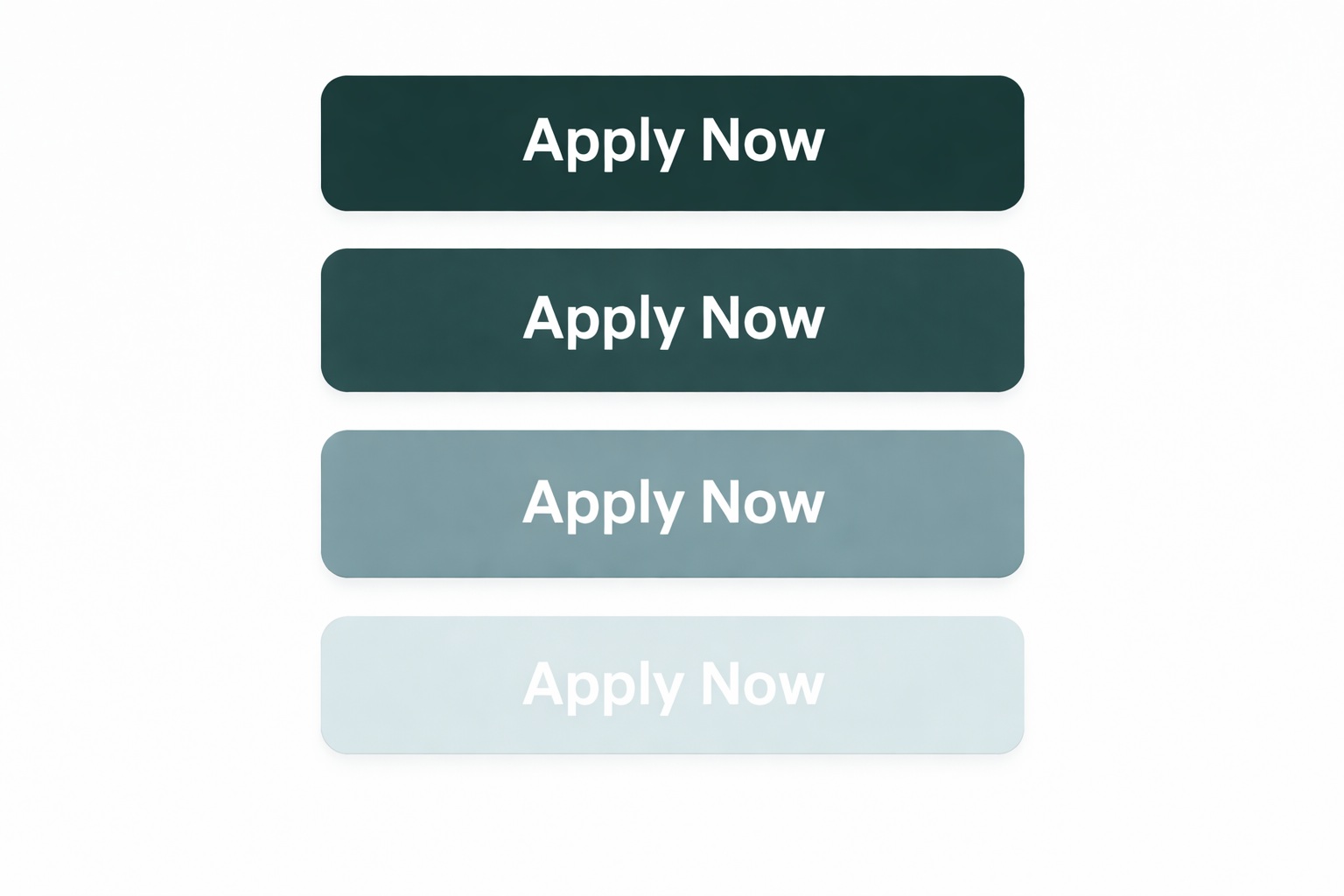
WCAG accessibility guidelines define minimum contrast ratios to ensure readability. You’ll need to meet these standards if your institution requires compliance.
The good news is: checking contrast is quick and free 🎉.
Tools like the WebAIM Contrast Checker let you plug in two colors and see instantly whether they meet accessibility guidelines.
If you're not sure which colors your site uses, you can check using your browser’s code inspector, or review your institution’s brand style guide to find the hex codes.
Even a slight adjustment can make a beneficial difference for people with low vision or color blindness, without significantly altering the overall look and feel of your site.
You’ve got this!
Accessibility is an ongoing practice, not a one-time fix. But it doesn't have to be overwhelming. Every little improvement adds up, and each change you make creates a better experience for more people. Start with the low-hanging fruit, and go from there.
If you're not sure where to start, Kairos can help. Whether you need an audit, hands-on support, or just a second set of eyes, we're here to make the process a little less daunting.